Building a scam-prevention app for older adults from 0 to 1
PRODUCT DESIGNER
PRODUCT DESIGNER
@
@
SILVERGUARD
SILVERGUARD

Context
Silverguard is a seed-stage company building a digital platform providing tools to identify, prevent, and respond to financial scams.
The initial focus was a B2C mobile app for the Brazilian market, where instant transfer scams disproportionately affect adults aged 60+.
Team Role
Led end-to-end design of Silverguard’s first mobile app for Android and iOS. Collaborated with founders, product, and engineering to define scope, prioritize features, and launch in 5 months.
Key responsibilities:
User flows, interaction, and visual design
Usability testing
QA with dev team
Led end-to-end design of Silverguard’s first mobile app for Android and iOS. Collaborated with founders, product, and engineering to define scope, prioritize features, and launch in 5 months.
Key responsibilities:
User flows, interaction, and visual design
Usability testing
QA with dev team
Led end-to-end design of Silverguard’s first mobile app for Android and iOS. Collaborated with founders, product, and engineering to define scope, prioritize features, and launch in 5 months.
Key responsibilities:
User flows, interaction, and visual design
Usability testing
QA with dev team
Outcomes
⭐️
4.6 star rating in Google Play


Problem Scope
Digital scams in Brazil have grown in volume and sophistication, outpacing financial institutions’ ability to respond. Older users were particularly affected, struggling with unfamiliar digital patterns and trust concerns.
Internal research identified core gaps:
• Victims often lacked guidance after a scam
• Recovery steps were fragmented across institutions
• Existing tools prioritized prevention, not response
Product Goal
Launch a consumer-facing mobile app to:
• Provide clear post-scam guidance
• Help users secure devices, accounts, and personal data
• Support users aged 60+
• Deliver an MVP in 5 months and iteratively improve the experience
Launch a consumer-facing mobile app to:
• Provide clear post-scam guidance
• Help users secure devices, accounts, and personal data
• Support users aged 60+
• Deliver an MVP in 5 months and iteratively improve the experience
Launch a consumer-facing mobile app to:
• Provide clear post-scam guidance
• Help users secure devices, accounts, and personal data
• Support users aged 60+
• Deliver an MVP in 5 months and iteratively improve the experience
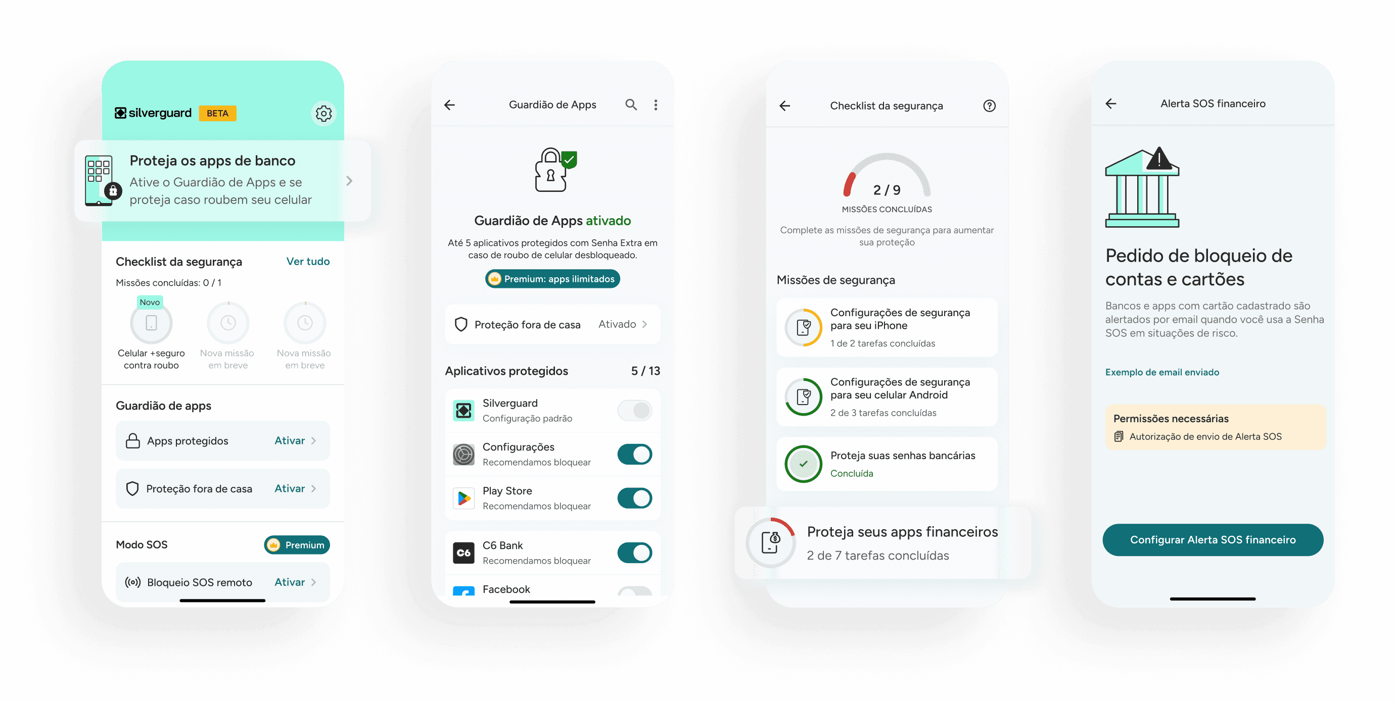
MVP Scope and Constraints
Mapping the affected user journey and applying the Kano Model directly informed feature prioritization. Given the 5-month deadline and a lean squad, the MVP focused on two core features:
• App Locker: restricts unwanted access to sensitive apps
• Security Checklist: step-by-step guidance after falling for a scam
Banking and edtech apps served as benchmarks, helping anchor the initial launch experience in familiar interaction patterns.
Because the app required extensive Android device permissions, I partnered with a third-party UX writer to clearly communicate permission requirements and instructions for the target audience.
Usability Validation
Moderated usability testing evaluated:
• Comprehension of app purpose
• Navigation and task completion
• Comfort with device permissions
Results validated the value proposition, but confirmed skepticism around device permissions:
• All users showed strong alignment with the app’s mission and value proposition
13 out of 19 key tasks were successfully accomplished by the majority of users
100% of users showed hesitation around granting device permissions

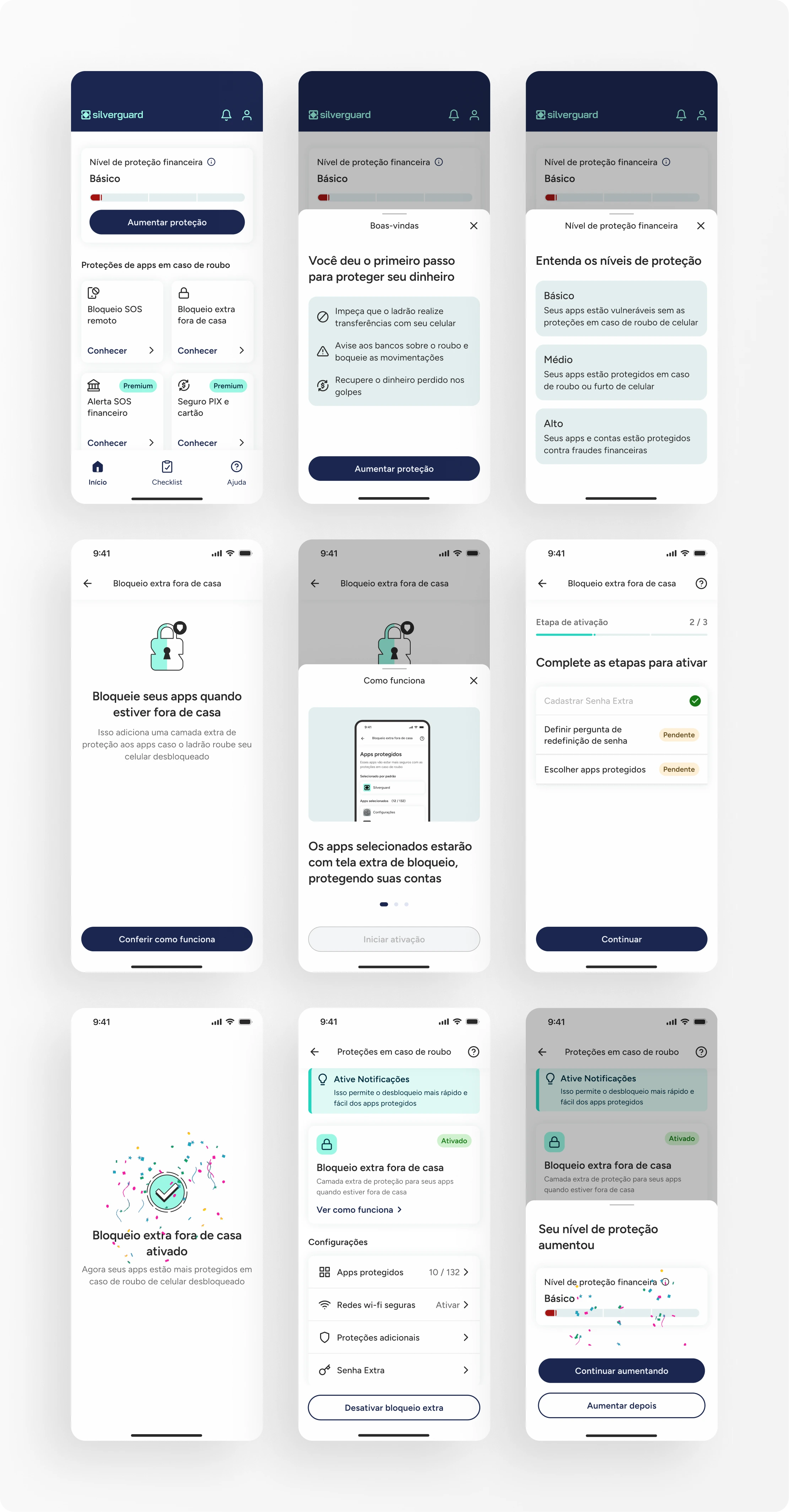
Redesign Explorations
User feedback revealed confusion around initial steps, leading to refinements aimed at reducing onboarding friction and improving clarity:
Prioritized onboarding for features with fewer permission requirements
Introduced progress guidance to accelerate time to aha moment and drive activation of higher-friction features

Outcomes
Delivered a simplified MVP on iOS in an additional 5 months, followed by a 4.6-star rating on Google Play for the Android release.
Recognized with three national design awards for Strategic Design, Service Design, and Positive Social Impact.
Status
After the second release, the development scope was reduced as the company reprioritized. The work remains a reference for trust-sensitive, accessibility-focused product design.
Download SOS Golpe app
Download SOS Golpe app


Karina Sato ©️ 2026
Product Designer
Karina Sato ©️ 2026
Product Designer
Karina Sato ©️ 2026
Product Designer