Turi Saúde
PRODUCT DESIGNER (UX/UI)
To respect client confidentiality, the data and assets presented here are limited to those I directly contributed to. All information provided reflects my personal perspective and does not represent the client’s views or opinions. Do not copy or distribute without permission.

Startup's Overview
Turi is an early-stage health-tech startup, in its validation phase, building an AI-copilot to reduce bureaucratic workflows for doctors so they can spend more time caring for patients.
My Role
I was tasked with redesigning the MVP to deliver a seamless and intuitive AI experience, considering functional requirements for the next version of the platform.
The Challenge
Doctors' daily routines are often burdened with heavy administrative workloads and complex workflows, leading to increased burnout and difficulty in balancing patient care with documentation.
Interviews with doctors showed their pain points:
Time-consuming documentation: writing EHR consumes much of the doctor's time.
Lack of eye-to-eye feeling: in need to multitask, doctors have less time for patient care, leading to constant frustrations.
Challenge in adopting new technology: given previous bad experiences and low digital literacy, doctors are prone to resisting new digital tools.
Solution & Impact
To validate the product in the market and address doctors’ intrinsic resistance on adopting new tools, I refined the user flow and redesigned the experience and interface.
😄
Client’s satisfaction
After final presentation and design handoff, client sent me positive feedback and informed that they would like to continue working together.the
🚀
Enhanced user experience and interface
Refining the user flow and minimalist design enhanced visibility of system status, multiple entry-points to start using the product and better system’s feedback for users.
High-Level Design Process
With a tight two-month deadline, I collaborated with the founder to define milestones from the outset, ensuring timely and successful delivery for the development phase. Here’s how the process unfolded.

DESIGN PROCESS
Heuristic Evaluation
Given the constraints of time and resources, I opted for a Heuristic Evaluation as an initial assessment method. I evaluated the process of recording and transcribing a consultation within the current MVP, identifying key usability issues and providing recommendations for improvement.

DESIGN PROCESS
Refining User Flow
After mapping the doctor's journey, I found that those handling ambulatory care follow similar workflows, making a highly specialized experience unnecessary at this stage. However, doctors have distinct needs for initial patient visits versus follow-ups, which informed the user flow design.
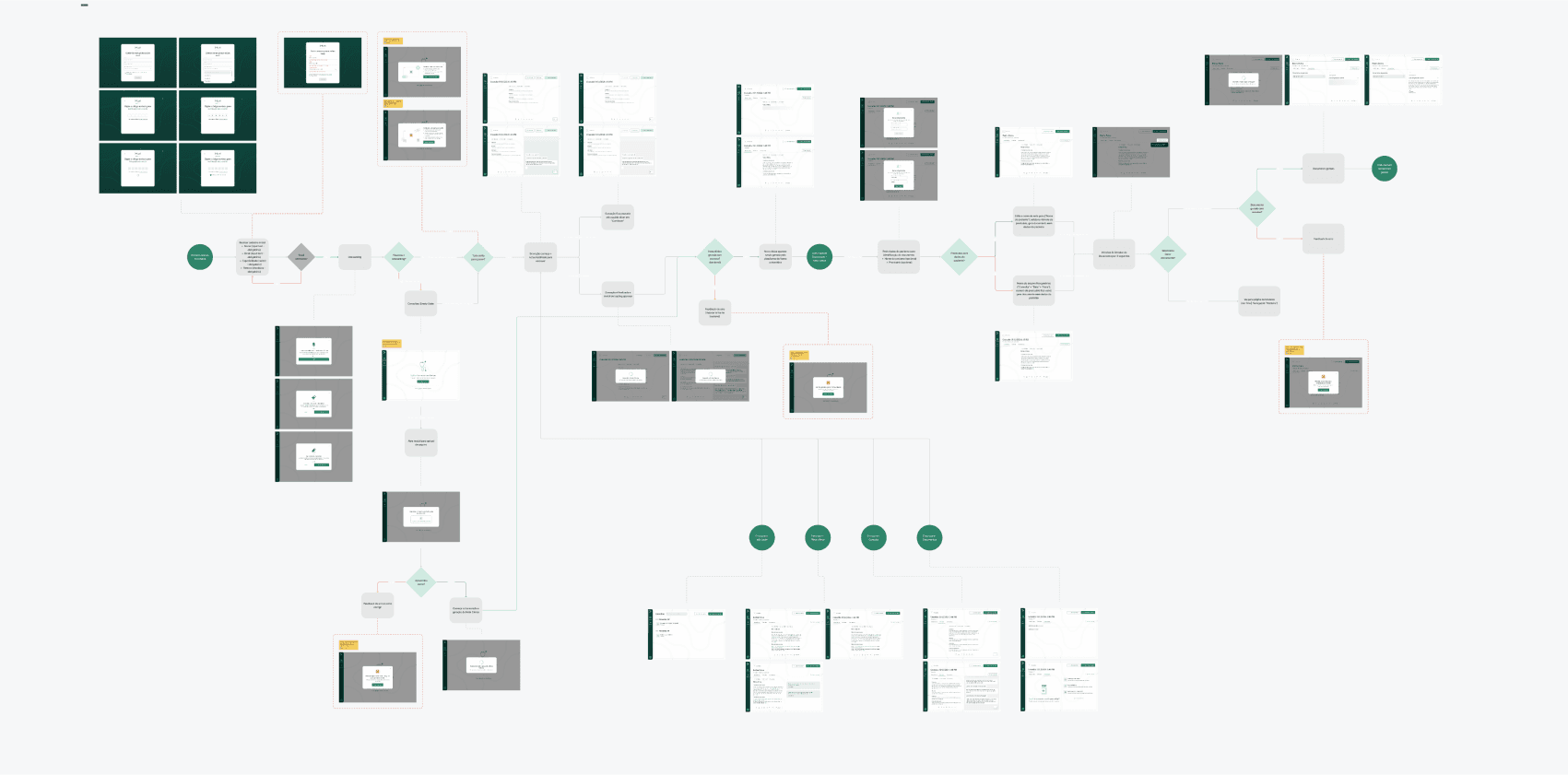
User Interface
Using heuristic evaluation, brand guidelines, and AI tool benchmarking, I designed the first version of the interface. After presenting it to the founding team, they approved the aesthetic direction. Several iterations followed before finalizing the design.
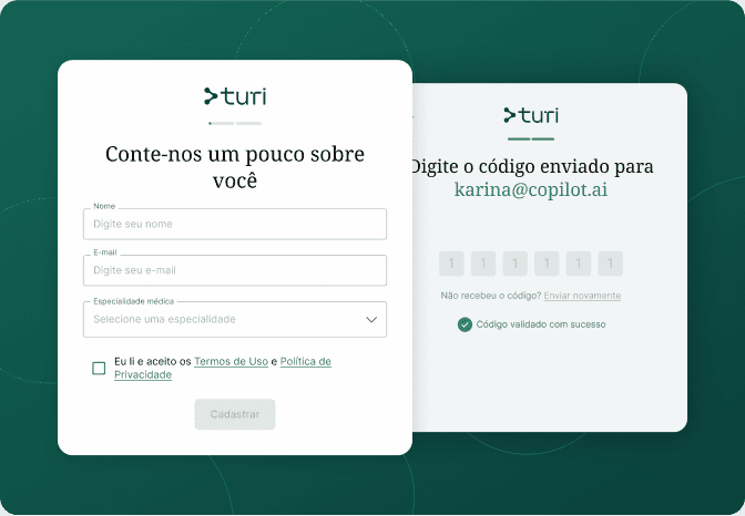
USER INTERFACE
Fast and frictionless Registration
A streamlined registration process enhances security and minimizes liability risks for the company. I implemented email verification to reduce friction and ensure a smooth onboarding experience.

USER INTERFACE
Minimum distraction on the Homepage
Recognizing doctors' resistance to new tools, the homepage was designed with a minimalist aesthetic to minimize confusion and encourage user engagement. The main action and value proposition were strategically positioned at the center of the screen to ensure clarity and ease of access.
USER INTERFACE
A 3-step introduction to the tool
If no interaction occurs within a minute on the homepage, an onboarding modal appears, highlighting key features to guide users and encourage activation.


USER INTERFACE
AI transcriber for patient visits
Ensuring doctors are aware that the AI transcriber is functioning correctly was a key concern. To enhance the Visibility of System Status, a moving wave icon was placed at the bottom, subtly indicating active recording without being intrusive. On the right side, doctors can view the transcription, with the option to collapse it for a distraction-free experience. Meanwhile, the left side of the panel allows doctors to add their own annotations.
USER INTERFACE
Office visit summarization
After completing the recording, the platform generates a summary of the patient’s health condition and the doctor's annotations as an Office Visit Summary, reducing doctors' administrative workload. To streamline the process and enhance efficiency, doctors are prompted to enter patient information only after the recording is finalized.
USER INTERFACE
Medical documents AI-generator
From the summarized Office Visit, doctors can generate prescriptions, treatment referrals, and other essential documents using AI. To improve efficiency, I ensured the Generative AI button remains accessible across all tabs on the Office Visit Screen. Additionally, doctors can preview and generate documents through the dedicated Templates section available on the left nav bar.

Next Steps
After delivering the handoff package, including user flow, designs, high-fidelity prototype, and UI Kit, the development team will proceed with implementation.
To refine the platform, integrating user feedback is essential for improving the model and minimizing errors, ultimately reducing associated costs. To validate usability and hypotheses, I propose conducting user interviews:
H1: Transcription enables doctors to focus more on patient care.
H2: Transcription decreases EHR documentation time, reducing stress and burnout.
Success can be assessed by key metrics, such as:
S1: Increased number of appointments per hour.
S2: Reduced time spent on health report documentation.
S3: Patient satisfaction when incorporating the AI solution.
Learnings
With AI tools evolving rapidly, I see design as essential to ensuring seamless human interaction. My experience with these tools has helped me refine the experience, but continuous iterations are key to unlocking AI-copilot's full potential and addressing its limitations.
Designing for doctors presented a unique challenge. To address this, I applied design principles to create a minimalist platform that reduces distractions and integrates effortlessly into their workflow.
Thank you for reading!
Let's connect!