Flourish Fi
UX/UI DESIGNER
To respect client confidentiality, the data and assets presented here are limited to those I directly contributed to. All information provided reflects my personal perspective and does not represent the client’s views or opinions.
Overview
Flourish Fi is a fintech startup empowering people to build better money habits. To support growth, the website needed a strategic redesign to clearly communicate the company’s unique value proposition and increase customer leads.
Outcomes
91% increase
in new users accessing the redesigned website
Context
Flourish Fi helps people manage finances better, boosting customer loyalty and insights for financial institutions. However, as an introductory sales channel, the website struggled to generate enough high-converting leads.User research uncovered key challenges, leading to three main focus areas for improvement.
Design process
01.
Highlighting value proposition and addressing readability issues
02.
Restructuring storytelling and targeting the right audience
03.
Expanding throughout Latin America
62%
didn't understand the company's value proposition when navigating on the website
40%
of the research participants had difficulty reading some of the visual elements displayed
25%
didn't know who the intended target audience was
DESIGN PROCESS
01.
Highlighting value proposition and addressing readability issues
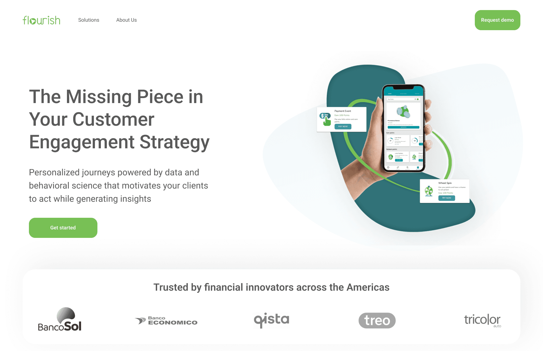
Users in the research struggled to understand the product, which we believed could be contributing to higher abandonment rates and a decrease in new leads.To address this, I restructured the website flow, prioritizing key information based on benchmark analysis. I also refined the images and used more straightforward illustrations. Additionally, I aligned the text to the left for better readability, removed background images, and incorporated real results to enhance the product's credibility.
BEFORE
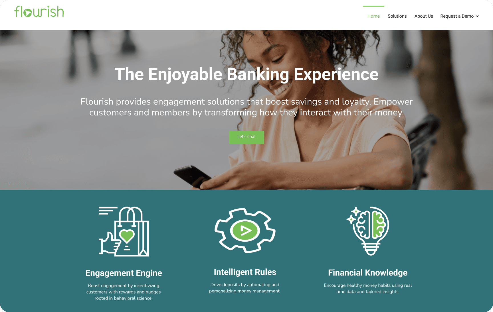
AFTER
DESIGN PROCESS
02.
Restructuring storytelling and targeting the right audience
The current website was not effectively targeting the right audience, leading to a lack of focus and potentially contributing to a 'leaky funnel'.To improve clarity and effectiveness, I collaborated with the marketing and design teams to refine the copy and enhance the value proposition for the target audience, emphasizing concise messaging supported by clear visual cues.
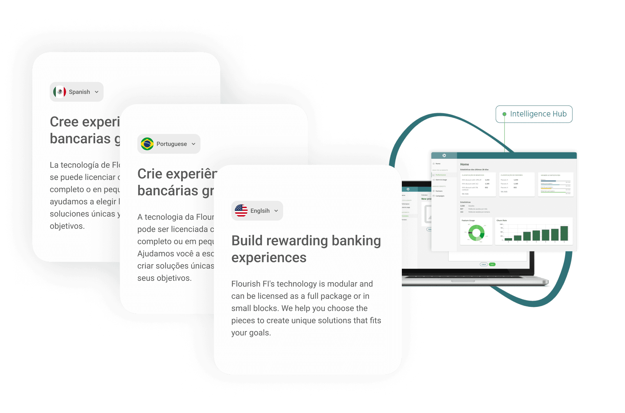
DESIGN PROCESS
03.
Expanding throughout Latin America
The startup's primary audience consists of Latin American financial institutions, making a multilingual platform a strategic move. Implementing a semi-automated translation tool allowed the website to support Portuguese, Spanish, and English, facilitating expansion into new markets.
Thank you for reading!
You can contact me at
karina.kyos@gmail.com
or send a message on LinkedIn.